SJSU iSchool Navigation Redesign
Redesigning the SJSU iSchool homepage navigation through card sorting, information architecture, and mixed-method research.Industry
My Role
January 2025 - May 2025
Desktop, Mobile
UX Researcher
& Designer
Higher Education
Platform
Timeline
Project Overview
The SJSU iSchool homepage relied on a hamburger mega-menu that made it hard for users to find what they were looking for. As part of a three-person UX assistantship team, I helped lead research, synthesis, wireframe design, and A/B testing to determine the most user-friendly information architecture.Problem Statement
The existing hamburger mega-menu placed too much cognitive load on users navigating the iSchool site. Content was buried, categories didn't match how users think, and there was no clear path for key audiences like prospective or current students to find what they needed.How might we restructure the iSchool homepage navigation to reduce cognitive load and better reflect the mental models of both prospective and current students?
Users
Identified User Groups
User groups were inherited and previously identified by SJSU UX management team.Well-Served
Returning students and faculty
Already familiar with the site structure and could locate content through memory or search, even if navigation was imperfect.
Underserved
Unfamiliar with the site, relying on navigation labels to orient themselves. The mega-menu structure didn't match their expectations or information needs.
Prospective and new students
Process
1 | Benchmarking Research
Audited navigation patterns from comparable university iSchool sites to establish benchmarks.Identified structural patterns and labeling conventions that worked well for similar audiences.Used findings to inform early hypotheses about what a hybrid navigation model could look like.
2 | Survey Design and Distribution
Designed a navigation feedback survey targeting current students and faculty across the iSchool.Built in A/B testing elements to compare two proposed navigational structures.Collected 184 responses, providing a broad quantitative baseline for IA decisions.
3 | Card Sorting Sessions
Facilitated card sorting sessions using a hybrid closed and open sort approach with think-aloud protocol.Led 2 of the 13 total participant sessions, observing how users naturally grouped and labeled navigation items.Captured session notes and synthesized patterns across all 13 participants as a team.
4 | Thematic Analysis and Synthesis
Used thematic analysis to synthesize qualitative feedback from card sorting sessions and open survey responses.Collaborated with interns and used LLMs to assist in interpreting large volumes of survey text.Identified recurring patterns in how users categorized content and what labels felt intuitive.
5 | Wireframing and Sitemap
Inherited existing Figma card sorting materials and wireframes from a prior project iteration.
Built an entirely new sitemap reflecting the updated IA informed by research findings.
Visualized proposed navigation structures to support stakeholder communication and handoff.
6 | Reporting and Stakeholder Presentation
Led the writing of a formal UX research report documenting methods, findings, and recommendations.
Presented findings to the UX Coordinator and Director in a team meeting, primarily leading the presentation myself.
Delivered the report as a handoff document to inform the next phase of the navigation redesign.
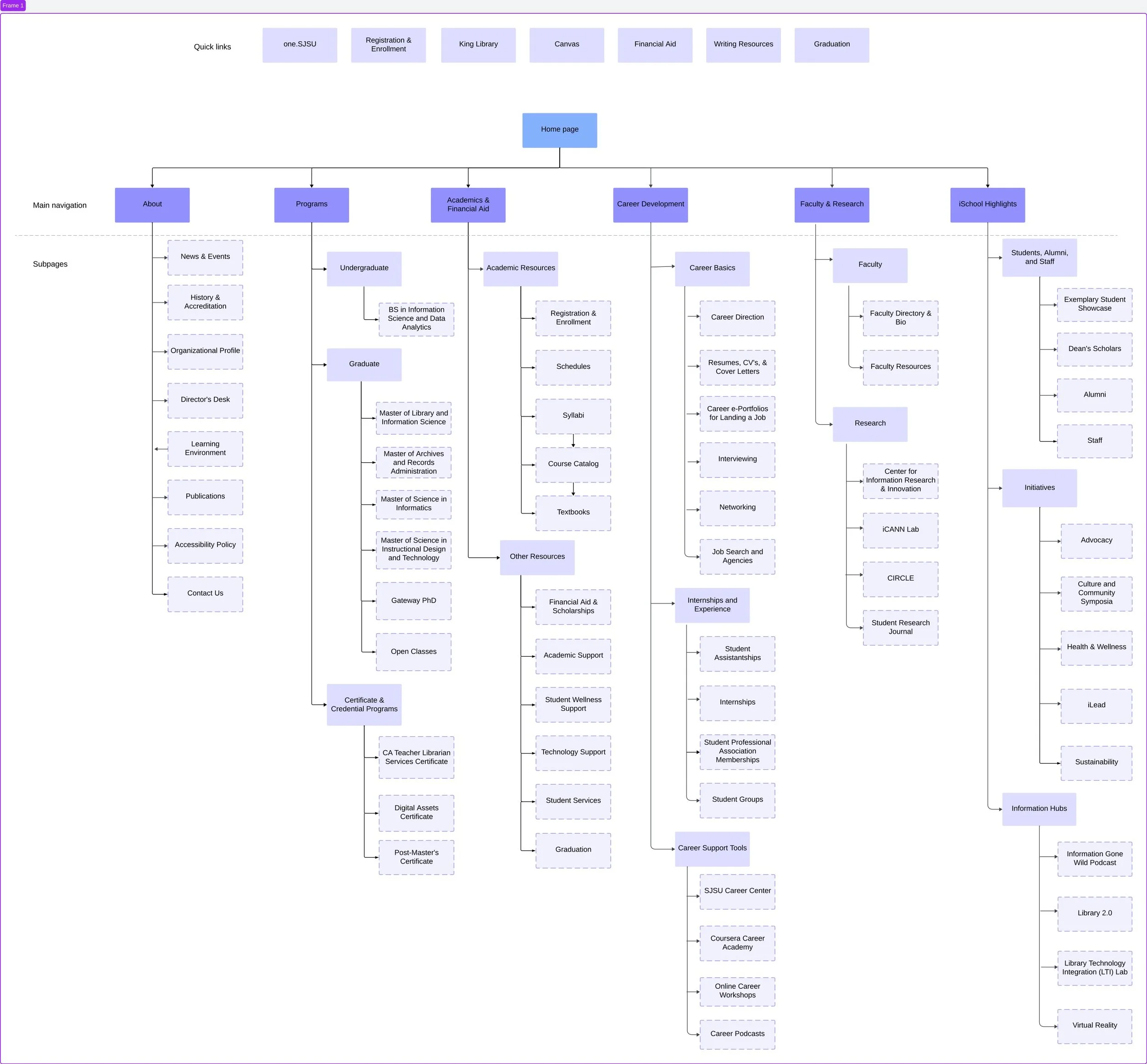
Final Sitemap
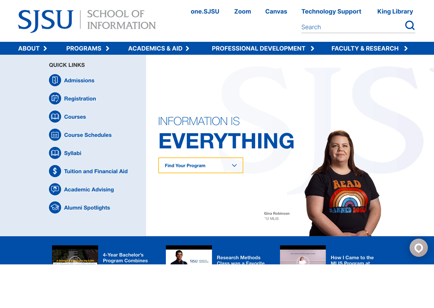
Wireframe Home Page
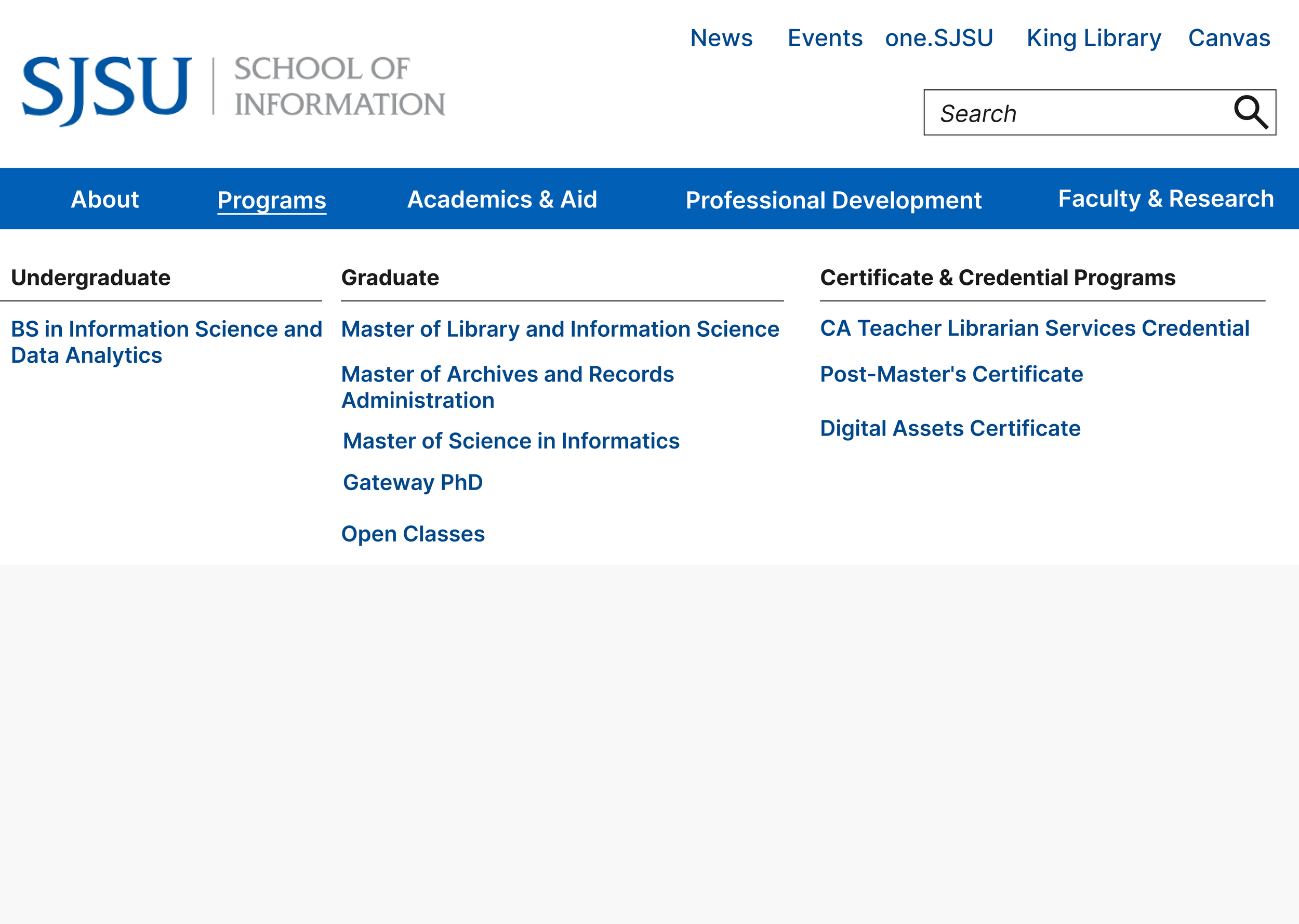
Wireframe A (A/B Testing)
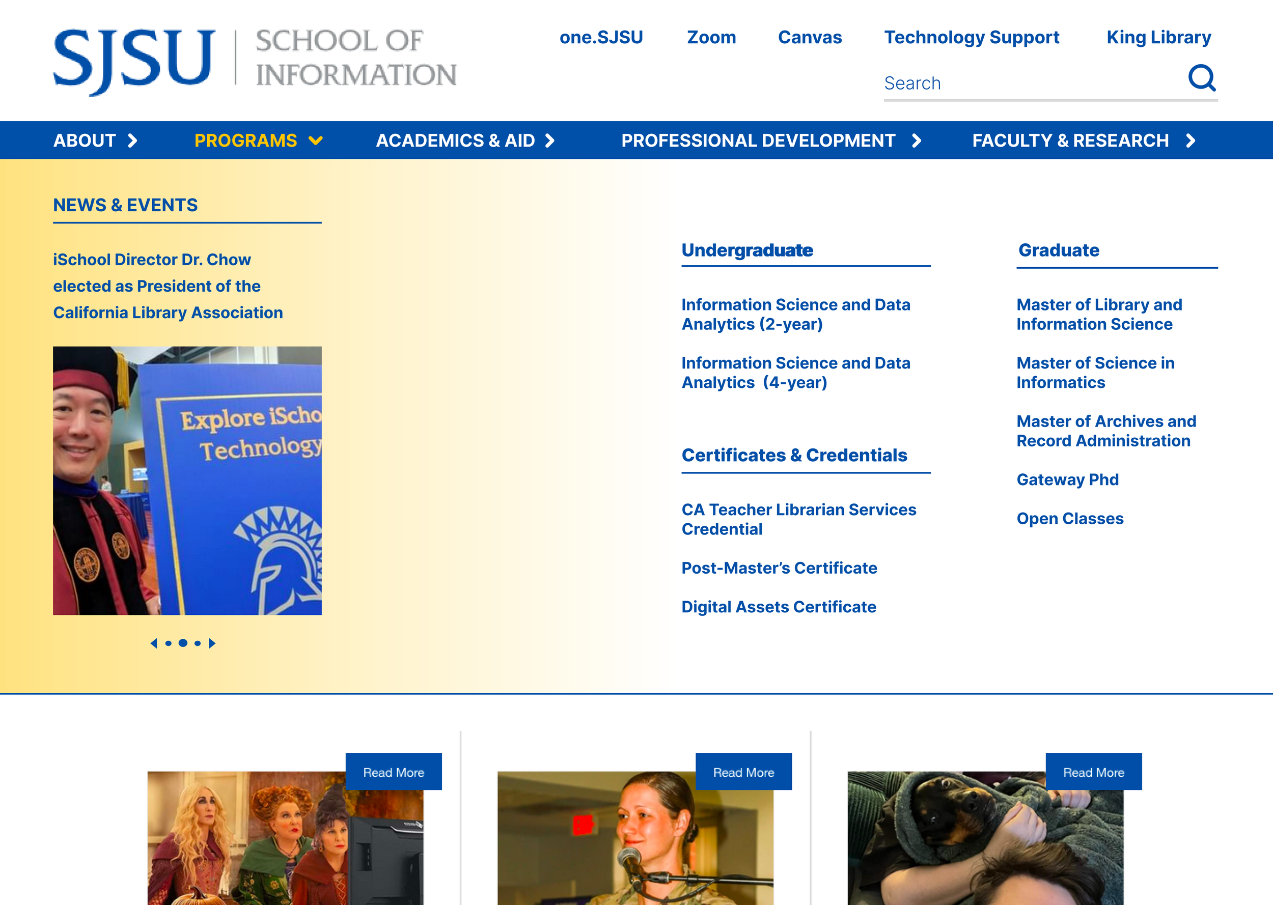
Wireframe B (A/B Testing)
Outcomes
My research findings directly influenced the next iteration of the iSchool sitemap, giving the team a data-backed foundation for the navigation redesign.
1.
I led the presentation of results to the UX Coordinator and Director, translating mixed-method research into clear, actionable IA recommendations.
2.
The project established a proof of concept for a broader navigation study, with 184 survey responses and 13 card sorting sessions providing a replicable research framework.
3.
Key Learnings
Mixed Methods Tell a Fuller Story
1
Quantitative survey data told me what users preferred, but the card sorting think-alouds told me why. Using both together made the recommendations much stronger and easier to defend to stakeholders.Mental Models Rarely Match Existing IA
2
Watching participants sort cards made it clear that the current menu structure reflected how the school organized itself internally, not how users think about finding information. That gap was the real design problem.Presenting Research is its Own Skill
3
Writing the report was one challenge. Presenting it to a director was another. I learned how to distill complex findings into a clear narrative that non-researchers could act on.