Scoop Ice Cream Truck App
Designing a mobile experience that helps Phoenix locals find, follow, and book a beloved neighborhood ice cream truck.Industry
My Role
Foodtech
Product Designer
Timeline
Platform
Ongoing Self-Initiated App
iOS (Concept)
Project Overview
Scoop is a fictional Phoenix ice cream truck brand I created as a self-directed concept project to explore mobile UX design for a local small business. I designed an iOS app that lets customers track the truck in real time, browse flavors, earn rewards, and book private events. The design went through two rounds of high-fidelity iteration to identify and solve usability issues along the way.Problem Statement
Ice cream trucks have charm, but they can be hard to track down. Even with some social media presence, customers often have no reliable way to find the truck in real time, see what is on the menu, or book it for a private event. For a small business trying to build a loyal following in a hot, competitive market, that friction is a missed opportunity.How might I design a mobile experience that connects Phoenix customers to a local ice cream truck in a way that feels as fun and warm as the business itself?
Users
I developed assumed personas based on common sense reasoning about who would realistically use a local ice cream truck app in the Phoenix area.Assumed User Groups
The Regular
A Phoenix-area parent or young professional.
Knows and love the truck.
Wants a faster, more reliable way to find it on a given day and rack up rewards for repeat visits.
The Event Planner
A neighbor, parent, or small business owner.
Wants to book the truck for a private event.
Motivated but currently blocked by a friction-heavy process that requires tracking down a phone number and hoping for a callback.
Design Process
1 | Sketching
Mapped core user journeys before opening Figma.
Identified the 5-tab navigation architecture early.
Established which features needed to be reachable in one tap.
2 | Wireframing
Translated sketches into structured screen flows.
Pressure-tested the layout across all five screens.
Caught a critical nav gap that left Rewards and Events stranded.
3 | High-Fidelty Design
Built full visual design in Figma and Canva.
Applied a warm, playful direction to match the brand personality.
Rooted the app in Phoenix with local event tie-ins like Spring Training and NASCAR.
4 | Iterations and Critiquing
Completed two full rounds of design critique and revision.
Addressed navigation gaps, inconsistent CTAs, and missing reward context.
Refined copy and visual hierarchy based on each round of feedback.
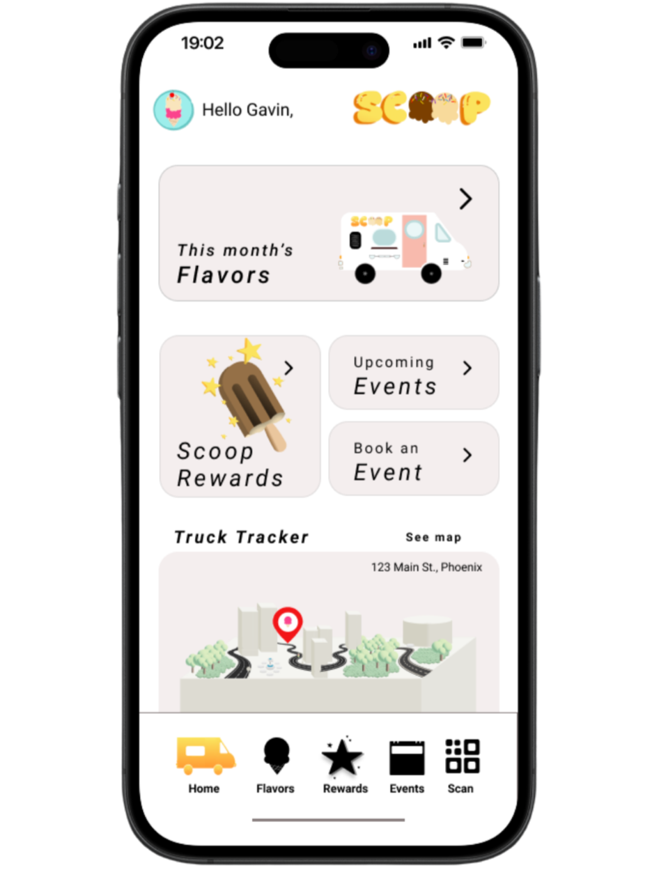
Scoop Home PageScoop Events Page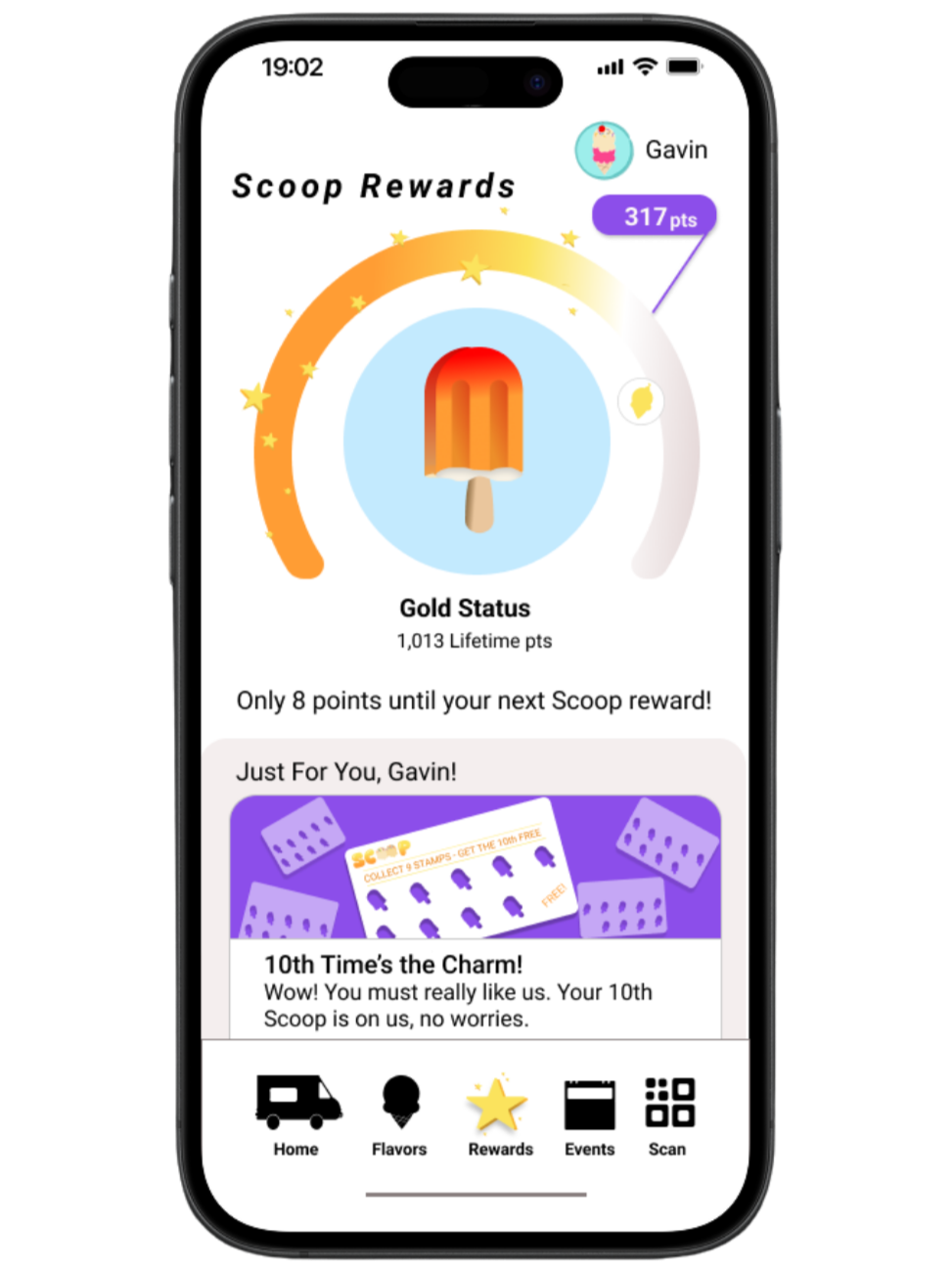
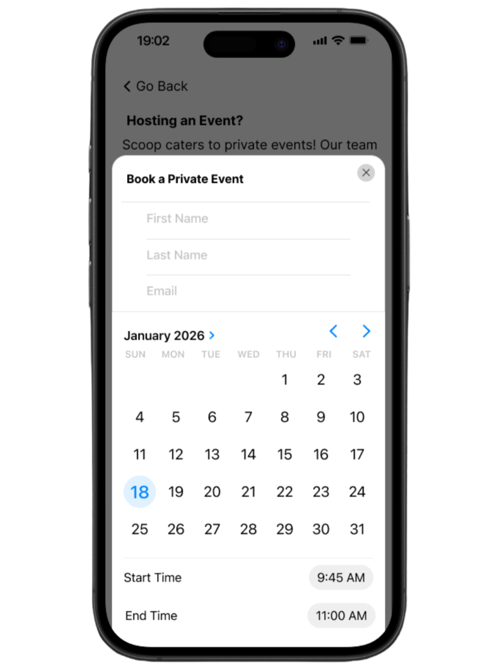
Scoop Rewards PageScoop Private Event Page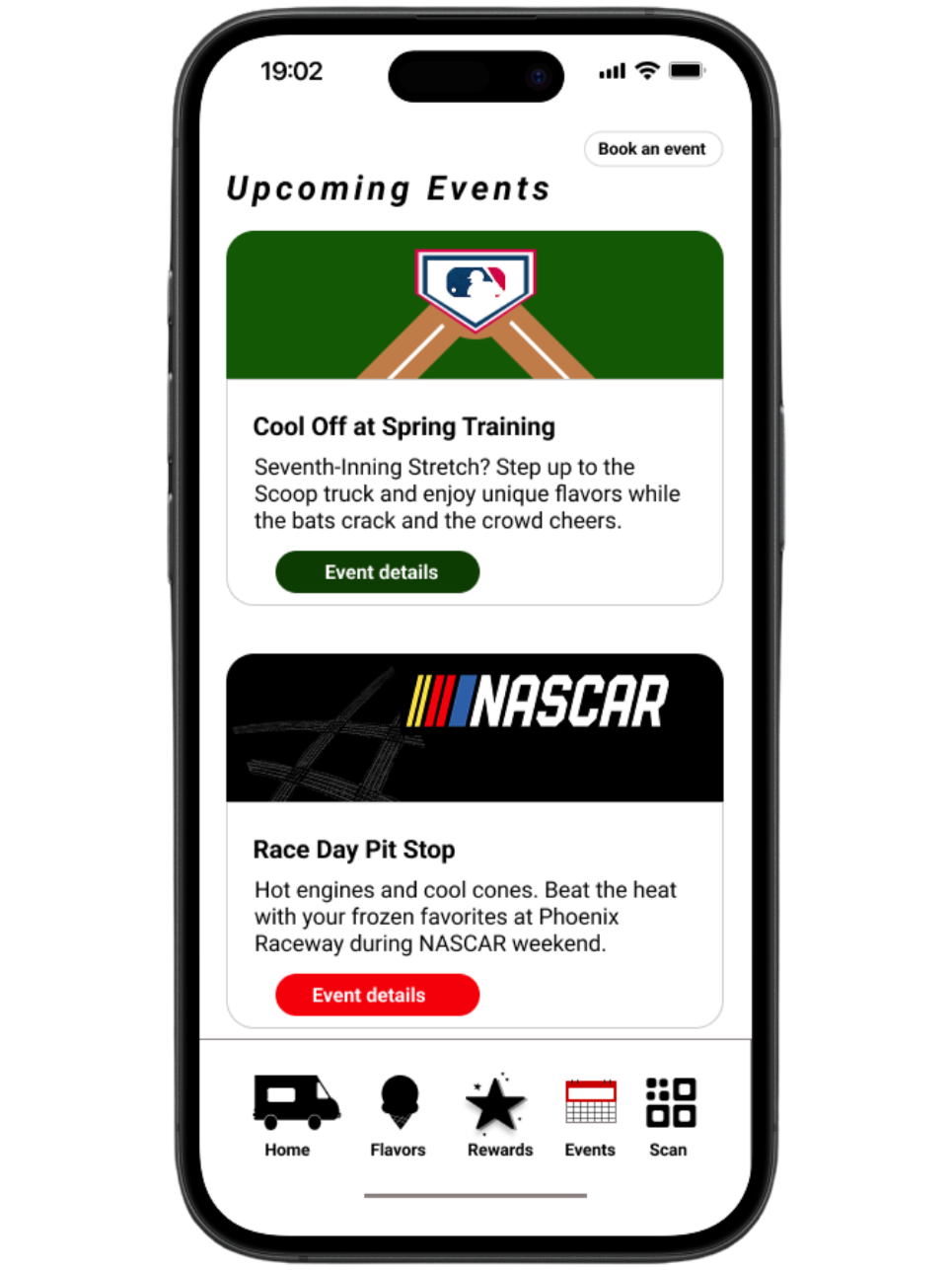
Outcomes
Every core feature is reachable with one tap from anywhere in the app. Expanding the navigation from 3 tabs to 5 eliminated the dead ends that existed in the original design.
1.
A static points display became a loyalty experience that tells users exactly how close they are to their next reward. Adding tier status and progress messaging gave the Rewards screen a motivating quality it was missing in the initial iteration.
2.
Local event tie-ins and plain language make Scoop feel designed for this city, not copied from a generic template. Rooting the app in Phoenix-specific moments was the single biggest differentiator in the final design.
3.
Key Learnings
The biggest improvement across both rounds of iteration was a single line of text, not a visual change. I learned to treat copy as a first-class design material rather than an afterthought.1
Copy is a Design Decision
Design for Flows, Not Frames
2
I learned to ask how a user gets somewhere from anywhere in the app before polishing individual screens. Thinking in flows rather than frames caught problems that looked invisible at the screen level.Local Context is a Strategic Differentiator
3
Tying the app to Phoenix-specific events and language made Scoop feel considered and intentional. The best UX decisions are not just functional, they are culturally aware.